How to create your own Facebook cover page
How to create your own Facebook cover page
Your Facebook Timelime cover can include a nice photo of you or one you took, but can also be any other photo you like, and can even be designed to include multiple photos, your name, your logo, graphics, and almost anything you can think of. Below you will find awesome and free place to create a unique Timeline cover for your profile that your friends and customers will not be able to miss.
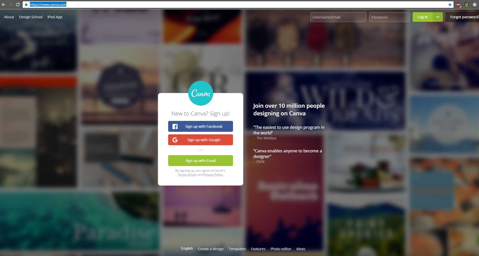
Step # 1: Open this link ➝ https://www.canva.com/
Step # 2: Sign up either from Facebook or from Google + profile ➝ Just follow certain steps which will pop up. It's very easy to sign up.
Step # 3: You will find many designs but you have to click on More. Check below picture....

Step # 4: Once you click More, there will be different types of templates/design. Scroll down and you will find Facebook cover..

Step # 4: Open Facebook cover, on left side of your screen you will find optional layouts, you can select from these or you can create your own by selecting plain background & edit it. This layouts gives you option of editing text...

Step # 5: Check my own created Facebook page cover➝

Step # 6: Once you done your editing, you will find download option on top right side of your screen. Click on it and you will get options PNG (recommended) or JPG format. Select any one and it will starts downloading.

This is the best & easiest way to create your own facebook cover. You don't need to pay for any thing and even this website offers you different designs for social media, presentation, blogs and many more.
Give thumps up and share.... https://www.facebook.com/NasrullakhaziSS/
By Nasrulla Khazi ⇒⇒ Subscribe YouTube


I'm on the fence about this, while more customization is good, I have a feeling this is a "in-progress" update, it just feels incomplete and half-way there.
ReplyDeleteWe use badge layout for apps on design approvals (visual projects), so the image being displayed is important. Old layout "feels like" it had larger images,
maybe because the images were cropped more loosely so it's easier to tell which project it was at quick glance. Now the image is cropped closer, making it
harder to scan thru at quick glance. I find myself needing to click into the project more often than usual. Which makes the whole user experience less
efficient.
I have a couple suggestions that might make it work better:
1. Increase the height of the window the cover image is being displayed.
2. Let us to choose which image to be displayed as "cover" (like how Pinterest handles cover images of each board, was hoping for this for a long time)
3. Let us adjust which part of the image to show and how tight or loose the crop is (with a fixed window, let us move the image around and maybe enlarge or
shrink it to control what shows thru the window. Pinterest does a limited form of this, which is very useful in making the cover image relevant)
4. Allow Cover Image to be ordered in different hierarchy (currently every element can be ordered differently except the Cover Image, it seems to be stuck
in the 2nd spot, would like the option to set it on another spot in the layout. This one seems like an easy fix, since you guys allow that for every other
element already)
Snappa's drag-and-drop editor, it’s quick and easy to create your own graphics for blog posts, social media profiles and ads. The tool provides access to more than half a million free stock photos, 70,000+ vectors and shapes, and 200+ fonts. It's free to download up to 5 files per month, or $10 a month for unlimited downloads
ReplyDeleteSnappa's drag-and-drop editor, it’s quick and easy to create your own graphics for blog posts, social media profiles and ads. The tool provides access to more than half a million free stock photos, 70,000+ vectors and shapes, and 200+ fonts. It's free to download up to 5 files per month, or $10 a month for unlimited downloads
ReplyDeleteI'm on the fence about this, while more customization is good, I have a feeling this is a "in-progress" update, it just feels incomplete and half-way there.
ReplyDeleteWe use badge layout for apps on design approvals (visual projects), so the image being displayed is important. Old layout "feels like" it had larger images,
maybe because the images were cropped more loosely so it's easier to tell which project it was at quick glance. Now the image is cropped closer, making it
harder to scan thru at quick glance. I find myself needing to click into the project more often than usual. Which makes the whole user experience less
efficient.
I have a couple suggestions that might make it work better:
1. Increase the height of the window the cover image is being displayed.
2. Let us to choose which image to be displayed as "cover" (like how Pinterest handles cover images of each board, was hoping for this for a long time)
3. Let us adjust which part of the image to show and how tight or loose the crop is (with a fixed window, let us move the image around and maybe enlarge or
shrink it to control what shows thru the window. Pinterest does a limited form of this, which is very useful in making the cover image relevant)
4. Allow Cover Image to be ordered in different hierarchy (currently every element can be ordered differently except the Cover Image, it seems to be stuck
in the 2nd spot, would like the option to set it on another spot in the layout. This one seems like an easy fix, since you guys allow that for every other
element already)